By Alisa Beer
At the final meeting of the Digital Humanities Graduate Group on April 23rd, Alisa Beer (that’s me) presented “Mapping Religious Concern in the Later Middle Ages.”
Jacqueline Howard followed with her presentation on the Bronx African American History Project and Digital History, which she wrote a blog post about for us. Since Jacqueline already posted about her topic, I will focus on my own presentation’s topic.
Mapping Religious Concern in the Later Middle Ages: Software Ups and Downs for DH Visualizations
My presentation derives from work I did for my MA thesis, Guido de Monte Rocherii’s “Manipulus Curatorum”: the Dissemination of a Manual for Parish Priests in the Fourteenth and Fifteenth Centuries.
The Manipulus Curatorum, or Handbook for Curates, is a text that instructs priests in their duties. It survives in 261 identified manuscript copies, the majority of which are either undated, or dated to the fifteenth century. This is, as medievalists reading this blog will recognize, a very large manuscript survival.
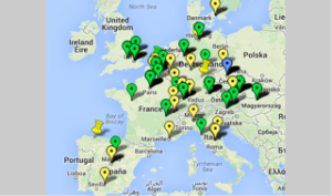
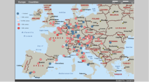
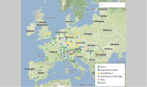
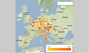
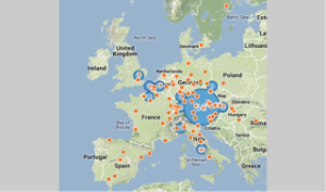
In order to figure out where this text may have been used, or at least, where its manuscripts are currently housed, I created a Google Map, in the fall of 2012. Then I used Microsoft MapPoint, in the spring of 2013 to create a similar map, and finally, in the spring of 2014, I tried CartoDB. The features of each differed, at the points at which I used them, and in this post I will discuss the ways in which each helped me to visualize my data and to get more information out of my spreadsheet of manuscripts in different ways.
This was helpful because it was:
–Easy to learn and to use, if time-consuming,
This was less helpful because it:
–Didn’t handle multiple pins in the same location well
–Did not import spreadsheets at the time I was using it (Fusion Tables has changed all of that!)
–Did not have many display options
This was helpful because it:
–Allowed for shading by density of points, which helped me see where the manuscripts were most concentrated.
This helped me to form a better view of where the manual had collected in the years since 1500. This was a fairly transformative realization, since it helped me focus my research geographically in ways that would have been harder had I relied on a spreadsheet and a general sense of how many were in Germany vs. Austria vs. England.
–Allowed for differentiation by features (such as date).
This allowed me to see, visually, exactly how many of the manuscripts were undated vs. fifteenth century, and how very rare the fourteenth-century manuscripts were, though I already knew that, and it wasn’t exactly a transformative realization.
–Imported data from a spreadsheet.
Oh, so lovely not to have to put every pin in by hand, and to be able to update the spreadsheet, re-upload the data, and not have to worry about finding the right pin and changing it individually.
Downsides included:
–A less-than-ideal visual display.
I am not a fan of its graphics. They’re fine, but they’re not appealing to me at all.
–A difficult user interface.
I found it cumbersome to work with, at best. I achieved my goals with it, but only by dint of stubbornness, online searching for help topics, and a good deal of wasted time.
–A very expensive paid version: $299.99, and a slightly hobbled trial version.
Enough said.
CartoDB
I liked CartoDB best of the options I tried because it:
–Has very flexible display options.
This was lovely. I was able to choose colors, map backgrounds, and other options, in order to visualize in the way I found most clear and helpful. This transformed my understanding of how the manuscripts moved, since I could see “only” thefourteenth-century ones, only the fourteenth-to-fifteenth-century ones, etc. I look forward to creating an animation of the spread of the printed editions using CartoDB, because it will be incredibly helpful, compared to a similar animation of the spread of printing in the same time period.
–Imported data from a more complex spreadsheet than MapPoint.
I was able to import my entire spreadsheet and select data displays that were more complex than I managed in MapPoint. This allowed me to differentiate between a wider variety of dates, for example, and to add extra criteria, or otherwise display information that MapPoint and Google Maps were unable to help me with (at the time at which I used them.)
–Was accessible online on any computer.
Downsides include:
–The need to sign up for an account, and limited functions of a free account, including the public visibility of free account data.
This didn’t deter me, but I think it might make some a bit leery. I’m also perfectly happy to have my data be publicly visible, but I know many people are not.
–The need for internet access.
While not always a problem, when my internet went out, I was very unhappy not to be able to use CartoDB at all.
–The cost of a paid plan — the least is $29.99/month.
This is, annually, more than MapPoint. And it’s a subscription service, so you have to keep paying for it.
Summary
While I like CartoDB better than the alternatives, I’m still going to keep an eye out for open-source mapping software, and try my hand at Omeka’s mapping options, because I’m not content to pay $29.99/month for the ability to have more than 5 tables. At the moment, I don’t need more than 5, but I’d like to have a better sense of what’s out there before I subscribe to any program.
Thoughts? Comments? Suggestions of other mapping software? All would be more than welcome!
