Topics in Digital Mapping: Georectifying Maps and Using Map Warper, Meeting Report

In the third installment of our Topics in Digital Mapping Workshop Series, “Georectifying Maps and Using Map Warper,” David Wrisley demonstrated georectifying to participants, showing us how to code maps and other images onto digital coordinates. David offered many possibilities for why one might want to georectify a map, including:

  • Organization of a catalog by spatial metadata

  • Mining information from analog data

  • Definition of borders that aren’t political or topographical

  • Rethinking the relativity of spatial representations and coordinate systems from an intentionally warped image

  • Map deformance, a way of thinking through the relative spatiality of documents that resemble maps

  • Or just for a nifty background to one’s own map

David also introduced us to some of the tools for georectifying, including the data format Keyhole Markup Language (KML or KMZ) and OpenStreetMap, an open access, collaborative project by rebellious mappers who chart neighborhoods for the public. Workshop participants then practiced georectification with NYPL’s Map Warper, using an 1873 map of Painted Post, NY, found at http://maps.nypl.org/warper/maps/11615.

For a list of links from this workshop, please visit http://www.tinyurl.com/fordhammapping9.

Blog post by Heather Hill, MVST student at Fordham University

Topics in Digital Mapping: Timelines and Palladio Meeting Report

Digital map makers are often interested in animating the spatial visualization over time or linking their maps to a timeline.  This session provided participants with examples of animations and timelines using Neatline and GeoTemCo.  The workshop also covered data formats and how time and mapping can be combined in Palladio, a free, web-based visualization platform designed for the humanities. All of the information provided to participants is available in a google doc.

We opened with examples of animated map visualizations. Two of particular interest are the Islamic Urban Centers project and the Atlas of Early Printing. While creating an animated visualization was not covered, these projects give a good idea for what the integration of time into our datasets can be used to do.

Abigail Sargent, MVST student, gave a brief presentation on the French of Italy NeatLine exhibit, a project that uses Omeka’s NeatLine plug-in to visualize the locations and dates of medieval French texts of Italian origin.

We then moved into talking about Palladio, and what each of the three main presenters are using it for. David Wrisley introduced participants to the idea of point-to-point data, of seeing the relationships of pieces to things in medieval texts. David Levine demonstrated some of the limitations of Palladio by pulling up a very large data set about medieval woodland and demonstrating how Palladio’s visualizations and network mapping can be useful. Alisa Beer drew on her research into medieval English libraries and demonstrated how Palladio can map points geographically as well as how the timeline function can be used.

We then broke into small groups and trouble-shot an intentionally broken data set, and then had participants create a .csv file based on Amtrak time tables from 1971, including the trip from New York to Boston.

Once participants had created a .csv file, we uploaded to Palladio and discussed the point-to-point map we had created!

Palladio Amtrak Image

Interested in learning more about Palladio?
Check out Miriam Posner’s tutorial to Palladio. Then open this google doc for participants, where you will find an intentionally broken data set to fix and upload into Palladio!

Topics in Digital Mapping: Getting and Organizing Spatial Data

Roman_Roads

The first workshop for the Topics in Digital Mapping Series was yesterday, January 21st.  David Wrisley introduced us to a variety of tools and ideas related to the process of getting and organizing spatial data. Participants were encouraged to try porting .csv files into Google Maps and to compare the visualization options with those available from CartoDB, which will be the subject of Workshop four in this series.

All participants were encouraged to create a data set for themselves for the next workshop, on February 11th, with 25 points and a temporal element, so they can map a topic of personal interest in Palladio.

All slides from the talk are available for download at http://tinyurl.com/fordhammappingday1

Mapping Religious Concern in the Later Middle Ages: Software Ups and Downs for DH Visualizations

By Alisa Beer

At the final meeting of the Digital Humanities Graduate Group on April 23rd, Alisa Beer (that’s me) presented “Mapping Religious Concern in the Later Middle Ages.”

Jacqueline Howard followed with her presentation on the Bronx African American History Project and Digital History, which she wrote a blog post about for us. Since Jacqueline already posted about her topic, I will focus on my own presentation’s topic.

Mapping Religious Concern in the Later Middle Ages: Software Ups and Downs for DH Visualizations
My presentation derives from work I did for my MA thesis, Guido de Monte Rocherii’s “Manipulus Curatorum”: the Dissemination of a Manual for Parish Priests in the Fourteenth and Fifteenth Centuries.

The Manipulus Curatorum, or Handbook for Curates, is a text that instructs priests in their duties. It survives in 261 identified manuscript copies, the majority of which are either undated, or dated to the fifteenth century. This is, as medievalists reading this blog will recognize, a very large manuscript survival.

In order to figure out where this text may have been used, or at least, where its manuscripts are currently housed, I created a Google Map, in the fall of 2012. Then I used Microsoft MapPoint, in the spring of 2013 to create a similar map, and finally, in the spring of 2014, I tried CartoDB. The features of each differed, at the points at which I used them, and in this post I will discuss the ways in which each helped me to visualize my data and to get more information out of my spreadsheet of manuscripts in different ways.

Google Maps
GM1

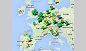
This was helpful because it was:

–Easy to learn and to use, if time-consuming,

This was less helpful because it:
–Didn’t handle multiple pins in the same location well
–Did not import spreadsheets at the time I was using it (Fusion Tables has changed all of that!)
–Did not have many display options
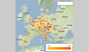
Microsoft MapPoint
MMP1

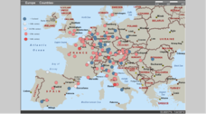
This was helpful because it:
–Allowed for shading by density of points, which helped me see where the manuscripts were most concentrated.
This helped me to form a better view of where the manual had collected in the years since 1500. This was a fairly transformative realization, since it helped me focus my research geographically in ways that would have been harder had I relied on a spreadsheet and a general sense of how many were in Germany vs. Austria vs. England.
–Allowed for differentiation by features (such as date).
This allowed me to see, visually, exactly how many of the manuscripts were undated vs. fifteenth century, and how very rare the fourteenth-century manuscripts were, though I already knew that, and it wasn’t exactly a transformative realization.
–Imported data from a spreadsheet.
Oh, so lovely not to have to put every pin in by hand, and to be able to update the spreadsheet, re-upload the data, and not have to worry about finding the right pin and changing it individually.

Downsides included:
–A less-than-ideal visual display.
I am not a fan of its graphics. They’re fine, but they’re not appealing to me at all.
–A difficult user interface.
I found it cumbersome to work with, at best. I achieved my goals with it, but only by dint of stubbornness, online searching for help topics, and a good deal of wasted time.
–A very expensive paid version: $299.99, and a slightly hobbled trial version.
Enough said.

CartoDB

CDB1 CDB2 CDB3


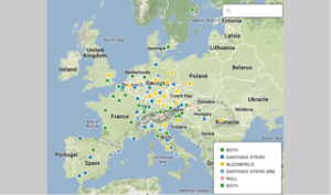
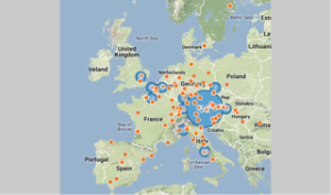
I liked CartoDB best of the options I tried because it:
–Has very flexible display options.
This was lovely. I was able to choose colors, map backgrounds, and other options, in order to visualize in the way I found most clear and helpful. This transformed my understanding of how the manuscripts moved, since I could see “only” thefourteenth-century ones, only the fourteenth-to-fifteenth-century ones, etc. I look forward to creating an animation of the spread of the printed editions using CartoDB, because it will be incredibly helpful, compared to a similar animation of the spread of printing in the same time period.

–Imported data from a more complex spreadsheet than MapPoint.
I was able to import my entire spreadsheet and select data displays that were more complex than I managed in MapPoint. This allowed me to differentiate between a wider variety of dates, for example, and to add extra criteria, or otherwise display information that MapPoint and Google Maps were unable to help me with (at the time at which I used them.)
–Was accessible online on any computer.

Downsides include:
–The need to sign up for an account, and limited functions of a free account, including the public visibility of free account data.
This didn’t deter me, but I think it might make some a bit leery. I’m also perfectly happy to have my data be publicly visible, but I know many people are not.
–The need for internet access.
While not always a problem, when my internet went out, I was very unhappy not to be able to use CartoDB at all.
–The cost of a paid plan — the least is $29.99/month.
This is, annually, more than MapPoint. And it’s a subscription service, so you have to keep paying for it.

Summary
While I like CartoDB better than the alternatives, I’m still going to keep an eye out for open-source mapping software, and try my hand at Omeka’s mapping options, because I’m not content to pay $29.99/month for the ability to have more than 5 tables. At the moment, I don’t need more than 5, but I’d like to have a better sense of what’s out there before I subscribe to any program.

Thoughts? Comments? Suggestions of other mapping software? All would be more than welcome!

Debates in the Digital Humanities

After a snow day last week, we met for the first time yesterday and discussed two articles from the book Debates in the Digital Humanities.

Debates in DH Book Cover
Debates in the Digital Humanities

The articles were “This Is Why We Fight”: Defining the Values of the Digital Humanities by Lisa Spiro, and Digital Humanities As/Is a Tactical Term by Matthew Kirschenbaum.

The two articles provide quite a contrast: Spiro’s is optimistic and all-embracing, and discusses the usefulness and larger possibilities provided by the process of articulating a values statement for the DH as a field; Kirschenbaum’s article is more pragmatic, and discusses the history of DH and how thinking tactically about the field’s uses, goals, and funding can be not only helpful for getting it implemented, but also for expanding and defining the field.

One criticism the group came up with was that while Spiro’s article does a good job of articulating goals, it is not very ‘digitally’ specific — almost all of her goals and values could be applied to the process of making academia in general, or humanities in general, a friendlier, more inclusive space. And while one attendee pointed out that this may be the goal of DH in the long term (to become the norm for humanities scholarship) in the present, it seems like a little more focus on the digital aspects of DH may be necessary.  Kirschenbaum’s more pragmatic approach seemed to have made our readers slightly more comfortable with his points and his overview of the history of the field provided talking points for discussion about the development of the field.

The variety of viewpoints of our attendees, from those who are relatively new to DH to those who have a more library-centric or more academically-centered focus, made for an excellent discussion. We were only sorry not to see more people there!

We look forward to seeing you at our next meeting:

HTML Resume Workshop
Tuesday February 18th
LL 802 (Lincoln Center) 1:30pm

Learn how to use HTML to make your resume more striking online: in the process you will not only learn how to make your resume look better on sites such as WordPress or other blogging platforms, you will also learn the basics of HTML markup language, which has a wide variety of applications, and is the basis of a number of other markup languages used widely in the digital humanities.

Presentation on "Digital Humanities" Graduate Course at Pratt) – 12/4/13

Last week, I presented to the Fordham Graduate Student Digital Humanities Group on the course I have been taking during the Fall 2013 semester at the Pratt Institute. While the class is taught in a Library Science Masters program, the professor (Chris Sula) and the bulk of readings and discussion are not library-specific. Below is a link to my presentation, which includes hyperlinks to several of the resources used in the class:Image of first slide of PresentationMy part of the discussion was to show how a graduate level course specifically on Digital Humanities can be structured. The benefit to the way this class was laid out (as well as the assignments required) has been the focus on learning about how this emerging field works socially, theoretically, and practically. This means that we did not focus on learning specific tools, although we were briefly introduced to and encouraged to play with several. Instead, we focused on what Digital Humanities research looks like; how is DH being adopted within/across the humanities; how to start, manage, and preserve projects; and, how to integrate thinking about the user into a project’s development.

After laying out this model, the group discussed whether such a course would be possible or appropriate to initiate at Fordham. Our discussion brought up a variety of concerns and ideas of how DH fits into the Fordham graduate experience – with respect to both research and teaching. There was enthusiasm for creating a Research Methods course for humanists (ex: for English and History students) to teach and discuss both traditional and DH methods of research. The thirst for integrating DH methods and traditional research was a promising result of this meeting.

Thanks to everyone who attended. We look forward to hosting some great events in Spring 2014!

Photo of Kristen Mapes– Kristen Mapes

Looking Ahead for Next Year

The Fordham Graduate Student Digital Humanities Group had a great inaugural year, one that ended on a high note with our guest speaker, Matt Gold. To see all the things we did, go to the Past Events page. Read about Mary Anne Myer‘s experiences with this group’s activities and beyond. For 2013-14, we will build on our activities by offering more of the same, including discussions and workshops to help teachers and students use technology in teaching and research, as well as nationally-recognized speakers. We also plan to add a few things, such as supporting those who wish to learn to code and hackathons.

In September, Patrick Burns will lead a discussion of Matthew Jocker’s book, Macroanalysis. This discussion will be accompanied by a month-long tutorial on topic modeling, designed by Patrick. (Read more about topic modeling here.) Check here for more information about that and follow us on Facebook. We constantly add updates about the group as well as other interesting things about the digital humanities in general.

For Fall 2013
>>Informal gathering of people will meet on campus to teach themselves how to code.
>>Zotero workshop
>>WordPress for course management workshop
>>Nominate two new HASTAC Scholars for 2013-14
>>Syllabi Hackathon
>>Wikipedia Hackathon
>>Plan a one-day DH conference for graduate students.
>>Plan a half-day workshop for graduate students on some aspect of digital humanities methods and practices for research, publishing, and pedagogy.

Omeka Workshop Was A Success

The vast digital humanities tent can seem overwhelming at times. The easier path would be to sit by the pleasant campfire at the site next door and toast marshmallows. But as 15 Fordham University faculty and graduate students learned during the Omeka workshop on April 3, the barrier to entry into the tent is quite low. Alex Gil, Columbia University’s Digital Scholarship Coordinator, did a terrific job leading the workshop.

Alex Gil, Digital Scholarship Coordinator, Columbia University

Omeka, as Wikipedia defines it, is a free, open source, content management system for online collections. It was developed by the Roy Rosenzweig Center for History and New Media at George Mason University, and was given a technology collaboration award by the Andrew Mellon Foundation.  Omeka is used by researchers, archivists, museum curators, students, and teachers.

For this workshop, Alex showed us a few notable sites–or exhibits, as they’re called–that use Omeka, including “Lincoln at 200,” a collaborative project involving the Newberry Library, the Chicago History Museum, and the Abraham Lincoln Bicentennial Commission. Then he carefully walked us through the procedure for creating an Omeka exhibit. Workshop participants brought a diverse collection of material to work on: from medieval manuscripts to pre-Columbian art to personal photographs.

The group felt so enthusiastic about Omeka, that a few participants have decided to reconvene in a few weeks and help each other develop their work. Marshmallows will be served. If you missed the workshop and want to learn more about Omeka, you’re welcome to join us. More details coming soon.

The Omeka Workshop was sponsored by the Center for Teaching Excellence and the Fordham Graduate Student Digital Humanities Group.

Omeka Workshop Participants